

In the first part of this series, we covered a blueprint for a successful data analytics strategy. Next, we’ll focus on how to create effective dashboards to help make the most of your data.
The Four A’s of a Great Dashboard
Every dashboard should aim to be the following:
Accurate
Your dashboard is only as good as the data you’re using, making this the most important step in your process. Be sure you’re cleaning up your data and gathering all the data sources you need that can help your end-users make informed decisions. Unfortunately, if this work isn’t done on the front end, it could result in your end-users being met with incorrect information, which may cause them to no longer trust or potentially use your work. After the data checks on the front end are completed, it also is important to make sure that all the dashboards you created are accurately tying back to the underlying data. It can be easy to make a mistake, especially when you’re using data sources that have varying levels of aggregation.
Actionable
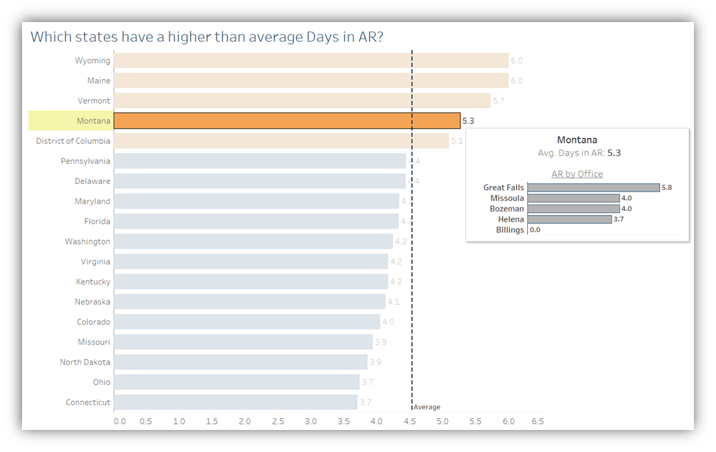
Now that your end-user has opened the dashboard you’ve created, what do you want them to do with or gain from it? Dashboards should have a clear and actionable purpose behind them that allows users to walk away knowing the next plan of action. If the goal is to monitor which relationship managers have a higher-than-average Days in AR, why not include a list of their accounts as secondary information—in the tooltip or in a separate table—so they can see exactly which accounts are contributing to that higher number? You’ve shown they have a metric they need to focus on, given them which account is causing the alert, and now they can contact that account to address the situation and make improvements.
It also is smart to consider the type of end-user that you’re developing for. You’ll often have a mix of different types of end-users accessing your dashboard, so it’s important to know their different needs. Sometimes they only need the high-level information and other times they need to see exactly what’s driving the values in the graph. Focusing on the types of questions your end-users want answered and what details they need to make the best data-informed decisions is imperative for creating an actionable dashboard.
Accessible
Accessibility in data visualization means creating a dashboard so as many people as possible can interact with it and understand it without missing important insights. To make your dashboard accessible, you need to consider both its design and how you want the user to interact with it.
Font, color, and negative space all need to be considered while designing. Make sure you’re using a font that’s easy to read and at least size 12 or a comparatively easy-to-read size. For color, you want to use a palette that’s easily understood by people with all types of vision. For example, avoid using red and green together and instead opt for orange and blue respectively. Vischeck is a great resource that allows you to test what your dashboard looks like to someone who is color blind. WebAIM Color Contrast Checker is another resource that can test if your color contrast is effective.
While it’s important to consider formatting best practices, it also is good to understand how your users will interact with your dashboard. How will they access it? Will they always be sitting at a computer or will they need to use it on a tablet or phone? The device that’s being used will change the layout and dictate what you want to place on the dashboard and how it can be interacted with. Finally, include directions on how the user should interact with your dashboard. As the developer, it’s easy to assume users will automatically know that clicking on something will filter the dashboard, what the size of a point on a scatter plot means, or that hovering over a point will offer some context with secondary information. After putting everything on the dashboard, take a second to look at it with fresh eyes and see if any additional instructions or descriptions need to be added.
Attractive
Finally, your dashboard needs to be attractive. In the data visualization community, the “5 Second Rule” means that your end-user needs to understand the purpose of your dashboard in less than five seconds of accessing it. The best way to make sure this is achieved is by making sure you’re not accidentally creating an overwhelming dashboard. Adding negative space and being intentional with the number of colors and graphs you’re using are some easy steps to take to create a clean and easily understood dashboard. Furthermore, only keeping the necessary parts that support your dashboard’s main objective and focusing on using graphs that are easily comprehended—rather than just flashy—also are best practices.
Data visualization allows for creativity in many ways, but it also is important to follow best practices to provide the best experience for the end-user. Designing your dashboard to be accurate, actionable, accessible, and attractive will be the differentiating factor between a good dashboard and a great dashboard..
If you have any questions or need assistance, please reach out to a professional at FORVIS or submit the Contact Us form below.