

When creating financial or other types of reports, there are some common characteristics that run through well-designed reports.
- Scalable – The report can run with varying and growing amounts of data.
- Well-performing – The report is reasonably fast, depending upon the amount of data, if not outright fast.
- Easy to understand – In a week, month, or year when you do need to make changes, the report is designed so that you or another person can understand how to make changes.
- Easy to change – When you make changes, you want to make them quickly.
This article will look at two approaches to report design. For comparison, we’ll use Microsoft’s Management Reporter with enterprise resource planning (ERP) solutions, including Microsoft Dynamics GP and Dynamics 365 Finance & Operations, and Solver Cloud.
Management Reporter has existed for many years. It was a replacement for FRx, which had support end in 2010—harking back to the DOS days. Management Reporter took over from there and many Dynamics clients use it today.
Management Reporter uses a spreadsheet-like interface for designing reports. On each row, you can link one or more accounts or account categories. As you add accounts, you modify the report designs. The more reports you have, the more reports you’ll need to modify.
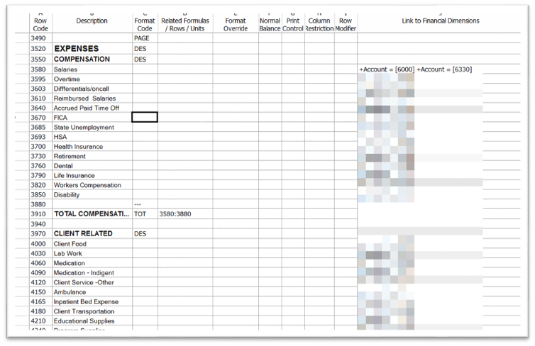
Notice there are two sections of accounts in the image above: COMPENSATION and CLIENT RELATED.
As was mentioned, each row can be linked to one or more accounts or account categories. You can use specific accounts or wildcards. For example, if a row should sum all accounts that start with 4, you can enter a GL link of 4???.
When you need to add accounts to the report, there’s an option to add them based on a range. This function, found on the Edit menu, can be very handy. You can add ranges that include just the main account or other elements, like the department segment.
Another helpful feature Management Reporter has is a utility that searches for missing accounts. Based on the accounts used in the report, the utility will provide a list of unused accounts that exist between the accounts used. For example, if the income statement uses accounts ranging from 4000 to 9999 and you have added account 4010 to the chart of accounts but not the report, the utility will let you know.
From a report design perspective, the more detailed the report should be, the more rows you need. If every expense account needs to appear, every expense account needs to be added to the report. This design methodology can lead to report formats with dozens of rows. The report shown above has 296 rows, including spaces and totals.
Now for Something Different!
If you actively create reports in Management Reporter or don’t because of the report creation process, here’s a much different way of building reports. This way uses groups of data that automatically expand when the report is run. Using groups, the number of rows in report design can be much smaller than what you saw in Management Reporter.
When a client provided us a report like the one shown above, we knew right away that we didn’t want to recreate it using the same line-by-line approach. That’s a lot of work! Thus, we thought, how can we do this report design in a way that minimizes rows in design but produces the same result?
This client uses the Solver Cloud reporting and planning solution. Solver Cloud, as you may surmise, is a web-based application. It’s published and developed by Solver Global. It uses Excel with an add-in. The add-in enables you to drag and drop fields into the Excel sheet. Once you add the fields, you can create groupings, filters, and parameters.
A good way to understand Solver versus Excel is this way:
Solver provides the Data Warehouse. The data is stored in the cloud in a Microsoft Azure SQL database structured for reporting and planning. This structure is like a star schema where you have a fact table (the transactions) surrounded by dimensions (the master records). Check out our FORsights™ article on using Solver as a data source for Power BI for more information about a star schema.
Excel provides this functionality, which we’ll call the Three Fs:
- Form – The structure of the report
- Formatting – How data is formatted, like using currency for numbers and bolding for headers
- Formulas – Totals and variances and other calculations are created using Excel functions
The best way to think of creating a report is to think of how pivot tables work in Excel. Pivot tables expand the rows and columns based on the data available. Solver reports can be built to work very similarly to pivot tables. Instead of building a report with 297 rows as described above, you can build a format with fewer rows and let the report expand.
Here’s a screenshot showing the complete design from top to bottom:
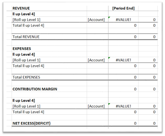
Notice how few rows there are! Yet, when the report is generated, it generates many rows.
How Does It Work?
You’ll notice in the Expenses section the bolded row and the row below it. The bolded row is a grouping that shows the headings like you see in the Management Reporter design. It’s using a filter to pull expense accounts and a grouping to show things like COMPENSATION and CLIENT RELATED.
Below the headers are the details, like Salaries and Overtime. Rather than using accounts, the report uses a grouping called Roll Up Level 1. Each group of accounts has a defined Roll Up Level 1. For example, Salaries comprises two accounts: 6000 and 6330.
When the report runs, a header row for each top-level group, like COMPENSATION, is generated. Then all the items that belong to COMPENSATION, based on Roll Up Level 4, are printed. Each account has a Roll Up Level 1 value, like Salaries, and a Roll Up Level 4 value, like COMPENSATION. It’s like having multiple account categories for each account.
By maintaining the groups to which each account belongs, you can control where it falls in the report. As you add new accounts, you should provide the values for the groups. If the ERP system doesn’t allow you to enter the data, you can enter it directly in Solver.
In Conclusion
Using Solver, you can greatly reduce the number of rows it takes to create a report. This streamlined approach to creating reports can help you have reports that scale, are easy (or easier) to maintain, are easy to understand, and generate efficiently.
For more information, please reach out to a professional at FORVIS or use the Contact Us form below.